OBJECTIVE
The objective of this project was to rebrand a local London restaurant to
increase patronage and create a stronger brand image.
PROCESS
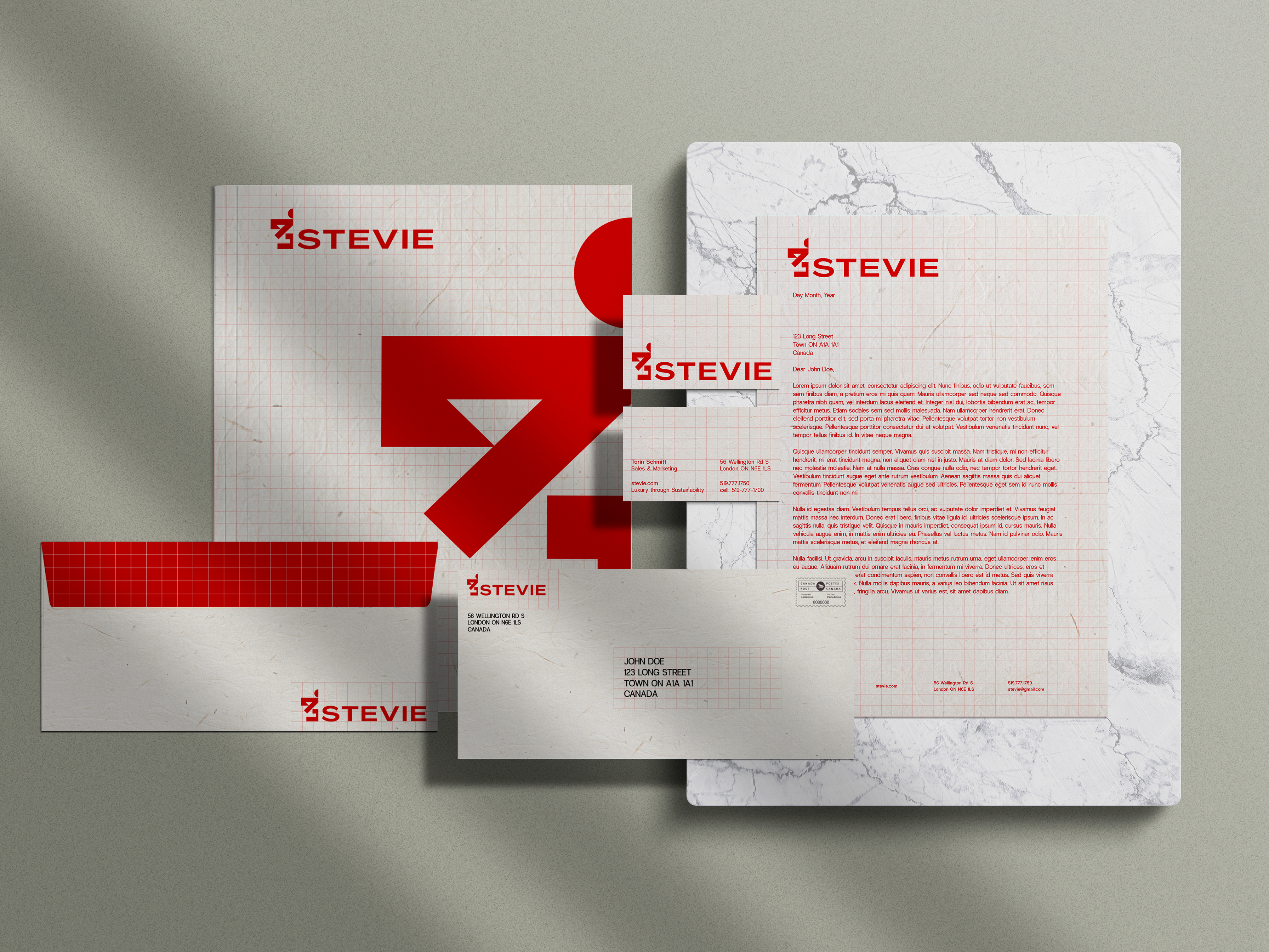
For this project, the chicken logo design represents the farm-to-table
aspect of the restaurant, and the following stationary design plays
off of the farm theme, with cracked eggs and egg shells. The primary
brand colour is a yolk yellow. A challenge with this project was creating
a paired-down menu for the food truck that matched visually with the
rest of the branding. The menu, as well as the food truck design, included
many illustrations in a similar style to the logo and stationary design. The
simple colour palette was very effective on the food truck design.


